Colour is one of the quickest ways to shape how guests feel at a corporate holiday event, but it’s also one of the easiest areas for planners to fall into generic choices. In 2025, the most successful palettes won’t come from following fashion trends. They’ll come from planners who create cohesion around a single family of colours, then use texture and lighting to enhance the experience without exceeding the budget.
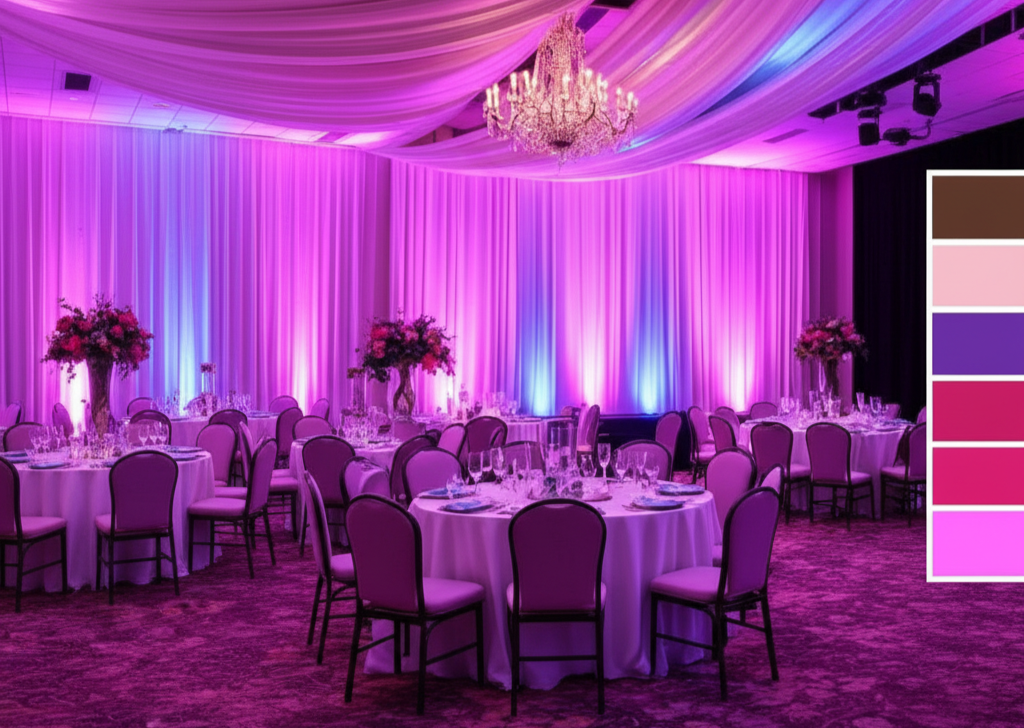
The first step is to establish a family foundation. Choose three to four shades within the same range, like moss, sage, and ivory, or sapphire, teal, and silver, and let those guide the room’s decor. For corporate events, this approach offers flexibility to blend brand colours, sponsor visibility, and holiday warmth without conflicting visuals. Maintaining a single colour family keeps photos consistent and ensures that when images are shared, the event appears intentional and polished.
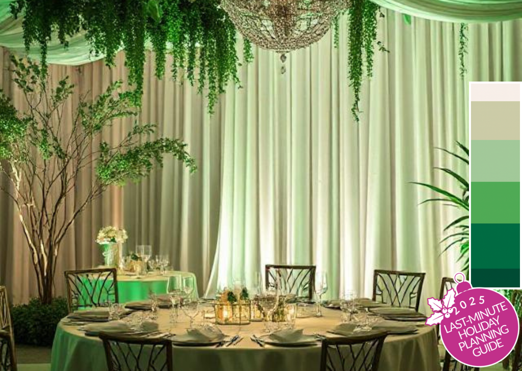
Next, layer texture. Guests may not recall every hue, but they notice contrast. Matte linens paired with metallic cutlery, velvet chairs complemented by acrylic accents, or greenery contrasted with LED panels all add richness without introducing extra colours. For holiday events, this is an affordable way to make a corporate ballroom feel curated rather than standard.
Lighting is where a palette becomes strategic. Instead of locking into one static look, let the lighting carry the shifts in mood throughout the program. Warm ambers at reception create a welcoming atmosphere, jewel tones during presentations feel professional, and bold washes for late-night events bring energy. These programmed transitions give guests the sense of multiple environments without requiring a change in décor. For corporations, that means more “moments” to capture on camera and more assets that feel on-brand.
Accessibility should always be an integral part of the design process. High-contrast colour schemes help guests navigate dim areas, while smooth lighting adjustments ensure the event remains inclusive for those sensitive to flashes. For companies, this isn’t just considerate; it shows inclusivity as part of their brand identity, which resonates well beyond the event.

Trends in 2025 show a balance between traditional and futuristic styles. Expect natural colours, such as terracotta, clay, and deep greens, combined with metallics, chrome, or holographic overlays. For planners, this mix is beneficial: it allows you to satisfy a corporate client’s desire for festive warmth while incorporating a modern touch that conveys innovation.
The ROI of cohesive palettes is evident. Photos and videos appear sharper, sponsor recognition is more explicit, and guests experience the event as a smooth journey rather than a series of mismatched moments. This consistency enhances recall and reinforces brand association, precisely what corporate holiday events aim to achieve.
The main point is clear: don’t overlook colour. Anchor your design with a cohesive palette, add texture for depth, and let lighting reveal the variations. The outcome is a festive event that feels sophisticated, provides engaging content for stakeholders, and silently conveys brand values.